LinkedIn Banner Size: The Complete 2026 Guide
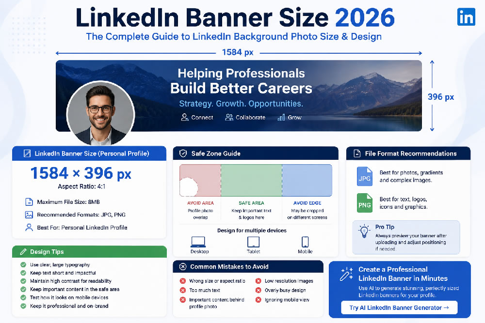
Your LinkedIn banner is one of the first visual elements people see when they visit your profile.
Also called a LinkedIn background photo, LinkedIn cover photo, or LinkedIn profile banner, this wide image sits behind your profile picture and gives you an opportunity to communicate your professional identity before someone even reads your headline.
But there is one common problem: what is the correct LinkedIn banner size?
If your image has the wrong dimensions, important text may be cropped, your design may look blurry, or your profile photo may cover an important part of the banner.
In this guide, we'll explain the correct LinkedIn banner size for 2026, the recommended file format, how to design around the profile photo, how to make your banner work on both desktop and mobile, and how AI can help you create a professional LinkedIn banner quickly.
What Is the LinkedIn Banner Size in 2026?
For a personal LinkedIn profile, the recommended background photo size is:
1584 × 396 pixels
That's an aspect ratio of 4:1.
LinkedIn's own help documentation currently recommends 1584 × 396 pixels for profile background photos. The maximum file size is 8MB, and LinkedIn supports JPG and PNG files.
Here are the key specifications:
| Specification | Recommended |
|---|---|
| Width | 1584 px |
| Height | 396 px |
| Aspect ratio | 4:1 |
| Maximum file size | 8 MB |
| Recommended formats | JPG / PNG |
| Use | Personal LinkedIn profile |
If you're creating a banner specifically for your personal LinkedIn profile, 1584 × 396 px should be your starting canvas.
Why Does LinkedIn Banner Size Matter?
Using the correct dimensions isn't just a technical detail.
A poorly sized banner can create several problems.
Your Image May Look Blurry
If you start with a very small image and stretch it to fit the LinkedIn banner area, the result can look soft or pixelated.
Important Content May Be Cropped
LinkedIn displays the banner differently depending on the device and browser window. LinkedIn itself notes that how the cover image appears can change depending on browser window size and screen resolution.
Your Profile Photo May Cover the Design
Your profile picture sits on top of part of the background image.
If you place your logo, headline, or other important information in that area, it may become partially hidden.
Your Banner May Look Fine on Desktop but Not Mobile
This is one of the most important considerations when designing a LinkedIn banner.
You shouldn't design only for the desktop view.
LinkedIn Banner Size vs. Other LinkedIn Images
It's easy to confuse the LinkedIn banner with other image formats.
Your LinkedIn profile contains several different visual elements.
LinkedIn Profile Photo
Your profile photo is square, although LinkedIn displays it as a circular image.
LinkedIn Background Photo
This is your wide banner:
1584 × 396 px
LinkedIn Post Images
These have completely different dimensions and shouldn't be used as your profile banner.
The key takeaway is:
Don't design your LinkedIn banner as a 16:9 image.
The personal profile banner uses a much wider 4:1 ratio.
Is the LinkedIn Banner 16:9?
No.
This is a common mistake.
A standard 16:9 image is much taller than the LinkedIn personal profile banner.
For example:
1920 × 1080 = 16:9
while:
1584 × 396 = 4:1
If you create a normal 16:9 image and simply upload it as your LinkedIn background, LinkedIn may crop the image to fit the banner area.
That means parts of your design could disappear.
Instead, create your design at 1584 × 396 px from the beginning.
What Is the Best File Format for a LinkedIn Banner?
LinkedIn currently supports JPG and PNG for profile background photos, with a maximum file size of 8MB.
So which one should you use?
JPG
JPG is a good choice for:
- Photography
- Lifestyle images
- Landscapes
- Professional portraits
- Image-heavy designs
It usually produces a smaller file size.
PNG
PNG can be useful for:
- Text-heavy banners
- Logos
- Icons
- Simple graphics
- Flat-color designs
If your LinkedIn banner contains a lot of typography or graphic elements, PNG can help preserve sharp edges.
For a photographic banner, a high-quality JPG is often a practical choice.
Keep Important Content Away From the Profile Photo
One of the biggest LinkedIn banner design mistakes is putting important information in the lower-left area.
Your profile picture overlaps part of the banner.
That means you should avoid placing:
- Logo
- Important headline
- Website URL
- Contact information
- Key graphics
- Face of a person
in an area likely to be covered by the profile photo.
Instead, think about your banner as having three zones:
Zone 1: Profile Photo Area
Keep this relatively simple.
Zone 2: Main Message Area
This is where your primary visual or message can go.
Zone 3: Supporting Information
Use this area for secondary visual elements or branding.
The exact visible area can vary by device, so don't rely on an extremely precise pixel boundary. The safest strategy is to keep critical content toward the center/right and preview the banner before publishing.
How to Design a LinkedIn Banner That Works on Mobile
A LinkedIn banner isn't viewed only on desktop computers.
Many people browse professional profiles on smartphones.
That creates an important design challenge:
Your banner needs to remain understandable even when the available viewing area changes.
Follow these principles.
Keep Text Short
Don't put a paragraph on your banner.
Instead of:
Helping technology companies build scalable AI-powered products through innovative software development solutions.
Try:
AI Product Builder | SaaS | Automation
Shorter text is easier to read.
Use Large Typography
Your banner may appear relatively small on a phone.
Small text can quickly become unreadable.
Use:
- Large headings
- Simple fonts
- Strong contrast
- Minimal text
Keep the Main Message Central
Don't put the most important information at the extreme left or right edges.
Those areas are more vulnerable to cropping depending on the viewing environment.
Test Before Publishing
After creating your banner, upload it to LinkedIn and check how it looks.
Pay particular attention to:
- Profile photo overlap
- Text visibility
- Logo placement
- Mobile appearance
- Overall balance
LinkedIn provides positioning controls when uploading a cover image, allowing you to adjust its placement before saving.
What Should You Put on a LinkedIn Banner?
The dimensions are only half the problem.
The bigger question is:
What should your LinkedIn banner actually communicate?
A good banner should support your professional identity.
For example:
Job Seeker
Software Engineer | React | Node.js | AI
Freelancer
Helping SaaS Companies Turn Ideas Into High-Converting Websites
Designer
Product Designer | UX/UI | Design Systems
Recruiter
Connecting Exceptional Talent With Growing Companies
Entrepreneur
Building AI Tools for Modern Businesses
Consultant
Strategy | Growth | Digital Transformation
Your banner doesn't need to explain everything about you.
Think of it as a visual extension of your LinkedIn headline.
LinkedIn Banner Ideas for Personal Branding
If you're using LinkedIn to build a personal brand, your banner can become a useful branding asset.
Here are some ideas.
1. Professional Minimalist
Use:
- Solid or subtle background
- Your professional title
- One short value proposition
This works well for corporate professionals.
2. Industry-Based Design
Use visual elements related to your industry.
For example:
- Technology → abstract technology visuals
- Finance → modern financial imagery
- Healthcare → clean healthcare imagery
- Real estate → architectural photography
- Marketing → creative digital imagery
3. Personal Brand
Use your:
- Name
- Professional role
- Brand colors
- Short tagline
- Website
This can be particularly useful for consultants, freelancers, creators, and entrepreneurs.
4. Career-Focused Banner
If you're actively looking for a job, you can use your banner to reinforce your professional positioning.
For example:
Product Manager | SaaS | AI | B2B Growth
This can immediately communicate your area of expertise.
Common LinkedIn Banner Mistakes
Even when the dimensions are correct, your banner can still look unprofessional.
Avoid these mistakes.
Mistake #1: Using the Wrong Aspect Ratio
Don't create a 16:9 image and expect it to fit perfectly.
Use 1584 × 396 px.
Mistake #2: Too Much Text
Your banner isn't a resume.
Keep the message concise.
Mistake #3: Tiny Fonts
If someone needs to zoom in to read your banner, the text is too small.
Mistake #4: Important Information Behind Your Profile Photo
Keep critical information away from the profile photo overlap area.
Mistake #5: Low-Resolution Images
Start with a high-quality image.
Mistake #6: Overly Busy Designs
Too many colors, icons, photographs, and text can make your banner difficult to understand.
Mistake #7: No Connection to Your Professional Identity
A beautiful image isn't necessarily a good professional banner.
Your banner should support your career, business, or personal brand.
Can AI Create a LinkedIn Banner?
Yes.
AI design tools can make the process significantly easier, particularly if you don't have graphic design experience.
Instead of starting with a blank canvas, you can provide information such as:
"I'm a software engineer specializing in AI and SaaS. Create a modern professional LinkedIn banner with a clean technology aesthetic."
An AI LinkedIn Banner Generator can then help create a design around your profession, personal brand, and preferred visual style.
The biggest advantage is speed.
Instead of spending hours searching for templates and adjusting dimensions, you can generate multiple concepts and choose the one that best represents your professional identity.
What Makes a Good AI LinkedIn Banner?
A good AI-generated LinkedIn banner should still follow the fundamental design rules.
It should have:
- Correct dimensions: 1584 × 396 px
- Readable typography
- Professional visual style
- Clear hierarchy
- Minimal clutter
- Appropriate colors
- Consistent branding
- Mobile-friendly composition
AI can help with the design, but you should still review the final image before uploading it.
LinkedIn Banner Size FAQ
What is the LinkedIn banner size in 2026?
For a personal LinkedIn profile, the recommended background photo size is 1584 × 396 pixels, with a 4:1 aspect ratio. LinkedIn specifies a maximum file size of 8MB and supports JPG and PNG.
What is the LinkedIn banner ratio?
The personal LinkedIn profile banner has a 4:1 aspect ratio.
Can I use 1920 × 1080 for a LinkedIn banner?
You can upload an image with different dimensions, but 1920 × 1080 is a 16:9 image and is not the recommended profile-banner ratio. Designing at 1584 × 396 helps you control the final composition.
What format should a LinkedIn banner be?
LinkedIn's current profile guidance supports JPG and PNG files for background photos. The maximum file size is 8MB.
Why does my LinkedIn banner look blurry?
A low-resolution source image, excessive compression, or an image that has been stretched can cause a blurry result. LinkedIn also recommends using a larger image if your cover image appears blurry or pixelated.
Why is my LinkedIn banner cropped?
LinkedIn's display can vary depending on browser window size and screen resolution. Your profile photo also overlaps part of the background image. Design with these factors in mind and use LinkedIn's preview/positioning controls when uploading.
LinkedIn Banner Size: Quick Cheat Sheet
If you just need the essential information, save this:
Personal LinkedIn Banner
1584 × 396 px
Aspect Ratio
4:1
Maximum File Size
8 MB
Formats
JPG / PNG
Best Practice
Keep important text, logos, and other critical information away from the profile-photo overlap and near the center of the design.
Final Thoughts
Getting the LinkedIn banner size right is the first step toward creating a professional profile.
For personal LinkedIn profiles, the recommended size remains 1584 × 396 pixels, with a 4:1 aspect ratio.
But dimensions alone won't make your profile stand out.
The best LinkedIn banners combine the correct technical specifications with a clear professional message, strong visual hierarchy, readable typography, and a design that reflects your personal brand.
If you don't have design experience, an AI LinkedIn Banner Generator can make the process much faster. You can create professional banner concepts based on your career, industry, and personal brand without starting from scratch.
Your LinkedIn banner occupies valuable space at the top of your profile.
Use it to tell people who you are, what you do, and what you want to be known for.
Create Your LinkedIn Banner With AI
Don't want to spend hours designing your LinkedIn background?
Try LinkPortrait's AI LinkedIn Banner Generator to create professional LinkedIn banners based on your career, industry, and personal brand.
Generate a correctly sized LinkedIn banner and give your professional profile a more polished first impression.